☠️ When Mascots Got Toxic!
A Brief History of Poison Prevention Characters

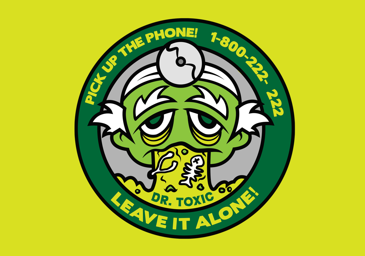
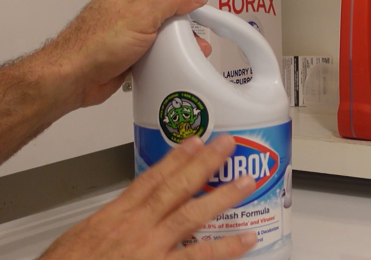
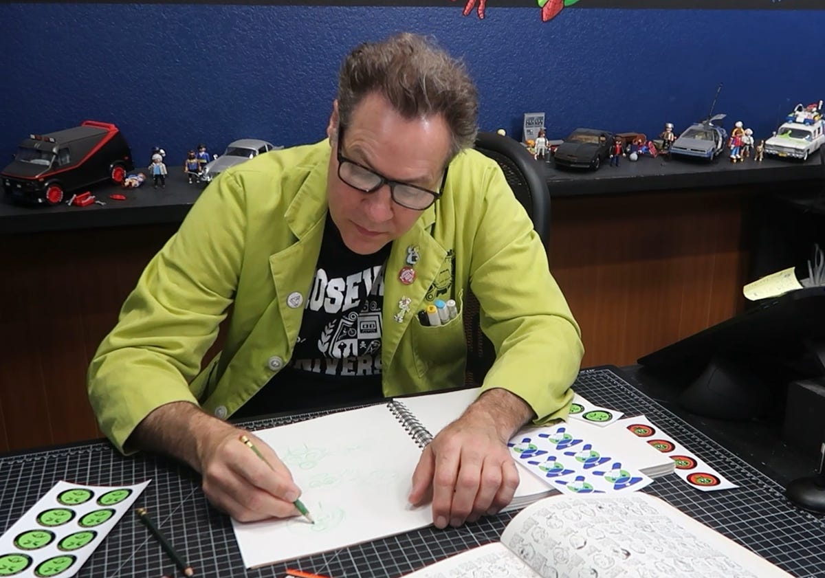
Greetings, nostalgia fans! Time to take another trip down memory lane to a time when poison control wasn’t just a phone number—it had a face. Sometimes a gross face. Sometimes a cartoon elephant. In my latest video, I reenvision the poison control mascot that was so ubiquitous growing up in the 70s and 80s. Check out the video, then download your free printable stickers here.
In the 1970s and 1980s, poison prevention mascots were a colorful, weird, and often unsettling way to teach kids not to eat things under the kitchen sink.
These characters were printed on stickers, posters, activity books, and even PSA jingles. Their mission? To plant one clear message in kids’ minds: If it looks like me, don’t touch it. Definitely don’t drink it.
The mascot boom started in the early '70s with a push from public health officials and poison control centers. Back then, household poisonings among children were a rising concern. Cleaning products, medications, and pesticides weren’t always clearly labeled—or safely stored.
Enter the mascots: a mix of psychology, marketing, and cartoonish repulsion. By using bright colors and exaggerated “grossed-out” faces, these characters aimed to make a lasting impression on kids who couldn’t yet read warning labels.
They had regional flavors, varying art styles, and... wildly different vibes. Some were genuinely off-putting. Some were sweet and well-meaning. Some were downright strange.
Here are a few standouts:
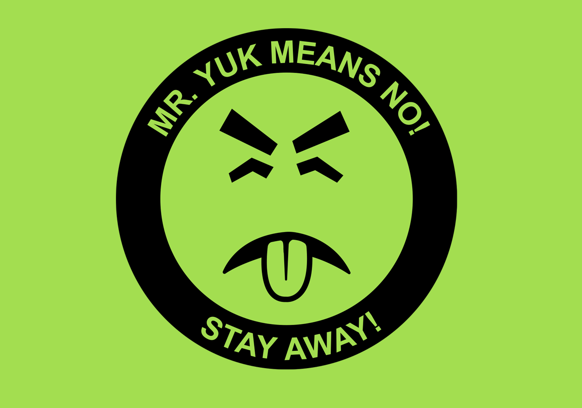
Mr. Yuk
"Mr. Yuk is mean… Mr. Yuk is green!"
Created in 1971 by the Pittsburgh Poison Center, Mr. Yuk was designed to replace the skull and crossbones, which kids associated with pirates (and the Pittsburgh Pirates baseball team). His bright green face and disgusted expression were meant to trigger revulsion, not curiosity. The campaign was a hit, spreading nationwide and inspiring imitations. Mr. Yuk is still remembered (and collected) today.
Officer Ugg
Arizona’s baffled but lovable cop.
Officer Ugg was a cartoonish police officer developed by the Arizona Poison and Drug Information Center. He was part of an educational campaign to teach kids how to identify dangerous substances.
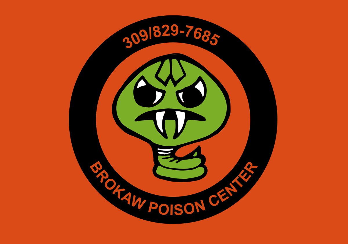
No! Siop!
The reverse-named reptile with a message.
Yes, his name is "Poison" spelled backwards. No! Siop! was a green cartoon snake created to slither into kids’ minds and hiss out a warning: stay away from dangerous substances. Often paired with educational handouts and classroom appearances, No! Siop! didn’t get quite the traction Mr. Yuk did—but he definitely earns points for the name alone.
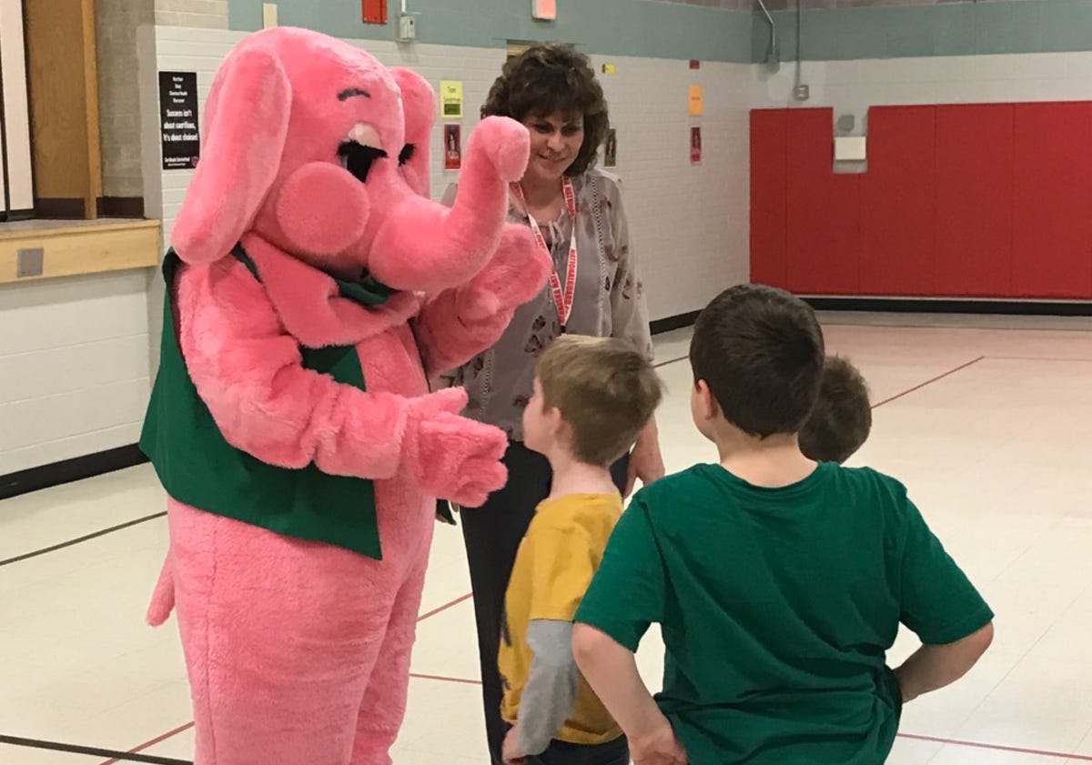
Pinky the Elephant
The poison mascot with the friendlier touch.
Pinky was a cheerful pink elephant mascot used in some regional campaigns, especially in the southern U.S. Her mission? To promote poison prevention. Pinky had a soft, friendly vibe and appeared on posters and safety guides. Her messaging was less “gross-out” and more gentle encouragement.
By the 1990s, most of these familiar faces disappeared. But why?
National standardization: The creation of the universal Poison Control hotline (1-800-222-1222) meant public messaging got streamlined. Fewer local campaigns meant fewer mascots.
Packaging got safer: Childproof caps, clearer warning labels, and better regulations reduced the need for character-based warnings.
Budget cuts & changing tactics: Many health departments cut back on outreach mascots in favor of digital campaigns and broader safety messaging.
And let’s be honest—some of these mascots were more confusing than helpful.
Still, the poison mascot era left behind some unforgettable characters.
Did one of these mascots live on your fridge growing up? Did you have a Mr. Yuk sticker sheet in your pencil box? Or maybe you're one of the few who actually met No! Siop! at a school assembly.
Leave a comment and share your memories—or just tell me what kind of mascot you would’ve made to stop kids from chugging pine cleaner in 1982.
Don't forget, my Patreon has an archive of all the project files I’ve created, including oison prevention stickers, both new and old
Stay safe,
Scott